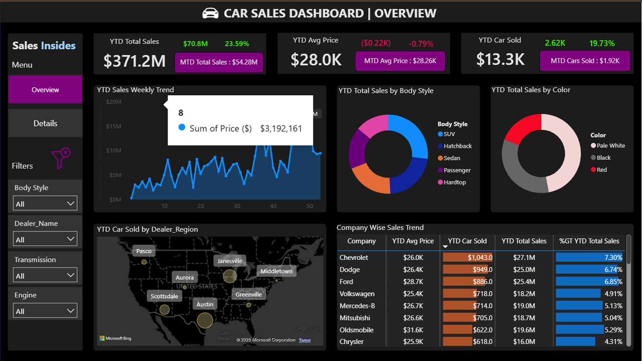
Data Visualization Best Practices
How effective visual design turns complex data into clarity, insight, and confident decisions.
Executive Summary
Data visualization is not about aesthetics alone. It is a critical communication layer between data and decision-making. This article outlines practical visualization principles that help analysts design charts and dashboards that reduce confusion, highlight what matters, and support real business action.
1. Start With the Business Question
The most common mistake in data visualization is choosing a chart before understanding the question.
Effective visualizations always begin with clarity around what decision the data needs to support.
Without a clear question, even accurate charts become visual noise.
A chart without a question is decoration, not analysis.
2. Choose the Right Chart Type
Different analytical questions require different visual forms. There is no universally correct chart.
- Line charts: Trends and change over time
- Bar charts: Category comparisons
- Stacked bars: Composition across groups
- Scatter plots: Relationships and correlation
- Tables: Exact values and detailed review
Simpler visuals often communicate insights more effectively than complex or decorative charts.
3. Reduce Cognitive Load
Every visual element requires mental effort to process. When dashboards contain too many colors, labels, or metrics, comprehension slows down.
Strong visualization design prioritizes simplicity.
- Limit unnecessary colors
- Reduce gridlines and visual clutter
- Avoid 3D effects and decorative elements
- Maintain consistent scales and axes
4. Use Color With Intention
Color should guide attention, not compete for it.
Neutral tones should provide context, while strong colors should highlight what truly matters.
If everything is highlighted, nothing is.
5. Write Insightful Titles and Labels
Titles and annotations shape how viewers interpret a chart. A strong title communicates insight, not just content.
Instead of stating what the chart shows, state what the data means.
“Sales Declined After Price Increase” communicates far more than “Monthly Sales Chart”.
6. Design for the Audience
A visualization designed for executives is very different from one built for analysts.
Before designing, consider:
- Who will view this?
- What decision must they make?
- How much time do they have?
7. From Visualization to Decision
A visualization is successful only when it leads to understanding and action.
The best dashboards make the important patterns obvious and the next step clear.
Good visualization does not impress. It informs, aligns, and enables decisions.